Fight Website Mediocrity With These 4 Tips

Your website is the most valuable piece of digital real estate you own. It should be a sacred place where your potential and returning customers can connect with your brand. One mistake I see time and time again is businesses taking the Kevin Costner in Field of Dreams approach — “If you build it, they will come.”
Newsflash: They won’t. Field of Dreams was fictional. If this happened in real life, Costner would be institutionalized.
Just because you’ve created a beautiful website doesn’t mean that your work is done. You need to continually update and innovate to keep your audience interested.
Here are a few ways you can combat boring on your website.
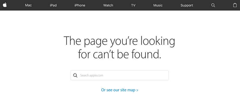
1. Scrap that ulgy 404 error page
Pause for one moment and ask youself this simple question:
What is the most boring, predictable part of your website?
For many of you, I’d assume the answer will be your 404 error page. 99% of businesses use the same format for these pages. They look something like Apple’s:
This is the standard online. Apple isn’t really following it’s “think different” philosophy here.
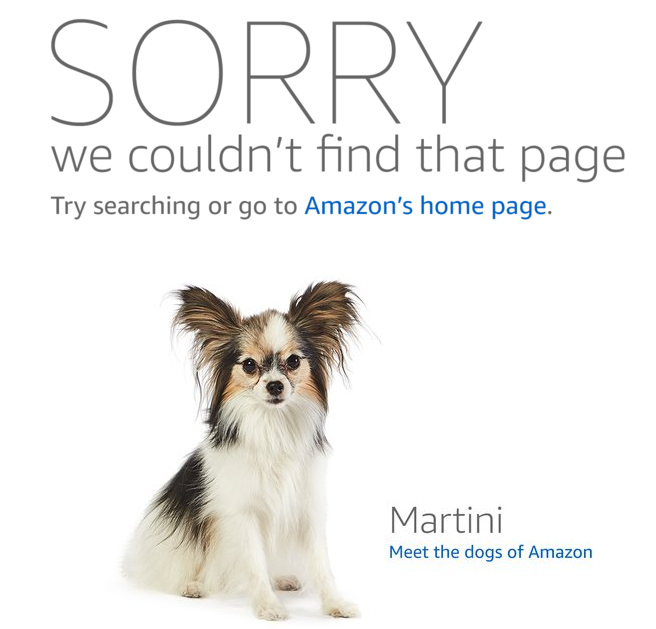
On the other hand, look at what Amazon is up to.
Every time you go to a 404 page on Amazon, you get to meet a new dog that helps out around the company headquarters. It’s a simple idea, but it grabs your attention immediately. What could have been a disappointing interaction with a website has turned into a happy accident. It endears visitors to the brand and humanizes the online experience.
Surprise and delight is a philosophy that all brands should embrace.
Here’s an example of how we spiced up our 404 page at Cave Social. It took us 5 minutes to put together, and I’ve probably received a dozen comments on it (not that I’m thrilled about people hitting our 404 page, but it happens to everyone).
2. Stop questioning everything
While filling out a credit card application online, I once overheard my dad quip that the process was “so boring it could put a crackhead to sleep.”
Forms aren’t exciting. Filling them out is definitely a chore. If you’re going to ask people it give you all of their information, the least you can do is try to spice things up a bit.
Get creative with any forms you have on your website. We added a check box that says “I just like checking boxes” on all of our forms, and just shy of 95% of people check it off when filling out a form. We get tons of comments on the silly thing. If you can make your customers smile while giving you their information, you’re doing something right.
3. Make your thank you pages thankful
If someone is landing on a thank you page or confirmation page on your website, you should be very thankful. Likely, this is going to lead to something good for your business. Awesome!
Take your gratitude and put a little bit of effort into building your next confirmation page. It doesn’t have to move the world, but don’t go with the generic page. Add a picture of your team members giving a thumbs up, show off your company culture, or do what my company does — add a picture of a baby piglet wearing sunglasses saying thank you. Surprise and delight!

4. Monitor your analytics closely
In particular, you need to pay attention to your bounce rate on any pages you’re promoting. If you’re seeing a high drop off rate on a particular page, it’s time to make some changes. Here are 4 metrics you need to pay attention to if you want to strengthen your bond with your website visitors.
As always, thanks for reading. Let me know if you want any honest feedback on your website — I’m happy to take a look. Here are a few other things bad websites have in common.